PRODUCT DESIGN
SINCERELY
Capital One
The Submission, Review and Approval Platform Behind Capital One’s Surprise & Delight
RESULTS
Reduced agent submission time by 60%
Increased submissions 30% month over month
Over 2,000 submissions by the end of 2022
Adopted by Capital One’s Card division
Reduced refresh rate to 30min vs 24hr
Eliminated role of 2 RPA bots
Enabled scalable framework
2022 Mark of Distinction winner

ROLE
UX & UI DESIGNER
While I was at Capital One, our front-line associates (called agents in the system) were spending a considerable amount of time manually submitting Surprise & Delight connections through an aged SharePoint site. This was driving a decline in submission quality and quantity.
The submission process was error-ridden and inconsistent, and there was no tracking system built in to monitor active cases or follow up with agents. It took long enough that agents rushed, which pushed rejections up and left submissions abandoned partway through. The need for a streamlined submission system that could help reduce manual effort, automate processes, and improve the quality of Surprise & Delight connections led to the development of Sincerely.
I designed the user experience and interface. Inline validation gave agents feedback as they moved through the application, and a submission-tracking system replaced the manual follow-up. Submission time fell 60%, submissions rose 30% month over month, and the data refresh came down from 24 hours to 30 minutes – all on a scalable framework that is now leveraged enterprise-wide.
Why a submission took so long
I met with the Surprise & Delight team and shared what we’d learned from interviews with agents. Agents were abandoning submissions due to frustration with the input fields and the time a single submission took. I developed personas and mapped out the current SharePoint journey. In the process I also noticed that SharePoint used blocking validation and gave no guidance about what any of the fields wanted.
Agents were only given their lunch hour or time after their working hours to submit Surprise & Delights. Without a way to pick up where they left off, submissions were rushed, which led to poorer quality and abandonment. They also learned as they went (nobody was going to sit through a tutorial before filing something on a break), so whatever the product needed to teach had to be legible at each field, in the moment.
The solution placed info icons beside the fields that needed explaining. Each one opened a modal dialog covering what that field was asking for, along with resources for what makes a strong Surprise & Delight. I tested them at each step of the flow, relaxed the blocking validation so input requirements no longer stopped progress, and added the ability to save at any point and come back later. A Drafts section on the welcome screen held the submission for five days from the customer interaction, and a personalized email linked straight back to the step where they’d stopped, so picking it up again didn’t cost another login and a hunt back to where they’d been.
Save and resume
Save Draft sits right next to Continue. The five-day window runs from the interaction date rather than the save date. A draft started on day four has one day left, not five, so the count has to be readable before an agent decides to stop for the night. The same red, yellow and green rail runs down the left edge of a draft row and an admin case card.
1 · SAVE


Save Draft sits beside Continue, not under a menu. The confirmation states the window.
2 · SEE

Home carries the count: 1 Expiring in 24 hours.
3 · RESUME

A rail on the leading edge, and a days-remaining band on the same 0–1 / 2–3 / 4–5 scale as the admin queue. Edit resumes the draft in place.
Another insight was that customer details were entered by hand. That was both a privacy problem and a time problem. So we built a framework that pulled the data securely from a linked server.
Customer data, not typed
Entering customer details by hand was both a privacy problem and a time problem. One account number returns both people on the account; name, address, phone and their past gestures from the linked server. The only thing the agent adds about the person is what they go by.

1 · ACCOUNT NUMBER
The only identifier the agent types.
2 · RECIPIENTS
Borrower and co-borrower both return, with address and phone already filled.
3 · S&D HISTORY
Shows the gestures this customer has already received.
4 · GO-BY NAME
The one thing about the person the agent adds by hand.
We then tested two selection patterns for the auto-populated data: radio buttons against checkboxes. Legal and preferred names were both surfaced so that the agent knew what the customer was actually called before the card was written. In a program about personal connection, getting the name wrong undid the entire gesture.
Legal name, go-by name
The account supplies a legal name. A program about personal connection needs the name the customer actually uses, and the only person who knows it is the agent who just spoke to them. One checkbox opens a field for it, and the admin side shows the name again so it can be checked before the card goes out.
LEGAL NAME ONLY

The field is there but closed. All the system knows is Scott Summers.
GO-BY NAME ADDED

One checkbox opens it, and “Scotty Summers” is saved with the submission.
These solutions provided a decrease in submission time and an increase in submission quality when measured during the Sincerely pilot program.
Why quality kept slipping
A low-quality connection was sent back for rework or denied. Even though a more robust and streamlined process of submitting a connection helped gather more submissions, it wasn’t making them any better. Around 38% of submissions came from first-time contributors. We needed a way to raise quality inside the product itself, not only through Surprise & Delight’s marketing material and training workshops.
Where rework lands
A reworked submission does not go back to the agent’s drafts. It returns to Pending Submissions with the status Rework Required.

1 · PENDING SUBMISSIONS
Rework comes back to this list, the agent’s working queue.
2 · THE ROW
Scotty Summers still sits under Scott Summers, the go-by name captured at intake travels all the way into the queue.
3 · REWORK REQUIRED
A status on a live list, beside the submissions still pending.
4 · EDIT
The agent reopens the submission from the row and works it again.
We tested two ways of delivering guidance at each step of the flow.
Option 1 kept the guidance behind an info icon beside each field. Click it and a modal dialog explained what that step was asking for, with the resources on what makes a strong Surprise & Delight.
Guidance on request
The dialog opens only when an agent clicks the info icon, next to the field they’re filling in.
CLOSED

The info icon beside Tell Us More!
OPEN

The same frame, one click later. Guidance for that field, on request.
Option 2 put the same information on the page, visible up front rather than behind a control.
Option 2 was too much information up front, pulling attention away from the work of making the submission.
Option 1 removed the unconditional interruption. Surfaced guidance stopped everyone, every time; the modal only interrupted users on request. On a first login, a short onboarding overlay pointed out the info icons and how to move through the system.
The program explanation lived in the product. Every screen carried the Surprise & Delight description in the footer, with Learn More and Contact links. This included all source material on Surprise & Delight, with job aids, quality submission examples, and a toolkit on best practices when having a call with a customer. The tool was designed to teach the program while you used it.
Teaching at each field
The same info icon opens the rule for the field it sits beside, here what counts as an acceptable gift. The program description stays in the footer of every screen in the flow, with Learn More and Contact S&D.
THE SCREEN

Gift Details, with the policy open over it.
AT EACH FIELD
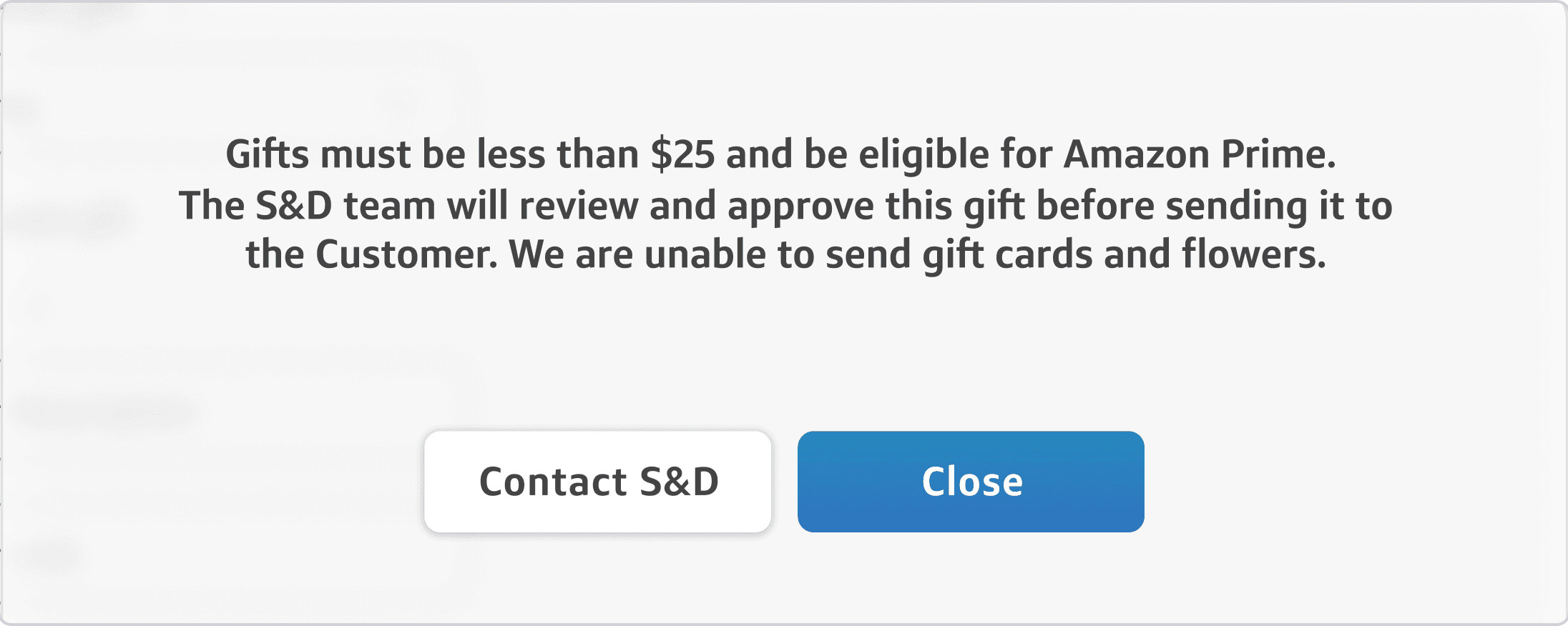
The rule where the choice is made: under $25, Prime-eligible, and S&D approves it.
ON EVERY SCREEN

The program description, Learn More and Contact S&D sit at the bottom of every screen in the flow.
The admin side: the queue
Designing the agent flow made clear that the Surprise & Delight team needed an admin side built to the same standards and integrated directly with the new agent features. The admins (the handful of people working submissions every day) had been working in a modified version of the agent SharePoint site, so we replaced it altogether and built one application to serve both sides, using internal systems for data verification and security.
I began the same way with the admin side as with the agent side: interviewing the admins, gathering the pain points in the current system, and asking what they wanted from a new one.
Progressive zoom
Three steps in, from the whole queue to one card’s days-remaining field, shown at twice its actual size.


Each marker shows where the next step is cut from.
Urgency strip
The sort control, then the whole list reduced. At this size the text can’t be read, but the red, yellow and green rails still show the order.
THE CONTROL

THE ORDER IT PRODUCES

DAYS REMAINING
0–1
expiring
2–3
mid
4–5
fresh
Nearly every case on this screen arrived on May 13.
So sorting by arrival date wouldn’t tell them apart.
One of the top three requirements was the ability to glance at how many submissions had crossed the “less than 3 days” mark. All submissions had a five-day window from the customer interaction for the card to go out, and it was imperative that the admins could filter these by days remaining. I played with background opacities, making full cards red, yellow, and green. This made the content harder to read, but showed me a rail running down the leading edge of the case cards, displaying the amount of time remaining. The same rail later carried over to the agent’s Current Drafts page.
Designing the triage review queue highlighted a need for a presence indicator. Many times one reviewer would be in a case reviewing the content, and another would jump in, doubling the effort and sometimes overwriting each other’s work. I came up with a few solutions that we tested with the admins and agreed that an avatar on the card’s trailing edge would act as the best indicator that someone was in that submission, and who. While someone was in it, the card’s View Connection Details button grayed out.
The reason for the connection became a structured field itself. Moving, new baby, veteran and so on. Those were what made the queue filterable, the gesture selection sensible, and the program measurable.
Preferred names were surfaced again in the review queue. It showed “Scott Summers” with “Scotty Summers” underneath so that a reviewer could check the name on the card against what the customer actually went by.
Exploded case card


1 · Identity
Case number, and status — whether this is a new submission or one coming back for rework. Filterable.
2 · Reason
Connection type as a structured field, and experience: the Financial Services subdivision the agent works in.
3 · Gesture
Card or gift, chosen by the agent at submission.
4 · Urgency
Days remaining, color-coded, and the rail that carries it down the leading edge.
5 · Ownership
Assigned agent, the reviewer’s avatar, and the button that grays out while someone is inside.
Language was a first-class filter in the queue, so a Spanish-language card reached someone who could write it properly.

The admin side: inside a case
Inside each submission, the admins needed to review the conversation and connection, add notes for feedback, send for rework, and complete the submission, which would begin the card-making process. The simplest approach was dividing the case detail view into three tabs: Connection, Fulfillment, and Feedback. Each view stayed focused instead of showing everything at once.

The Connection tab showed what the agent had gathered in the submission and the phone conversation.
Fulfillment was where admins could review the submission details for the card and the gift the agent chose.
The Feedback tab was where admins communicated with each other and sent a submission back to the agent for rework. The tab held three sections: Team Notes, Notes to Agent, and Customer Feedback, where the customer’s own response was kept with its date.
Connection

Fulfillment

The team writes the card from the agent’s answers, or finalizes the agent’s own note. Preferred names are captured by the agent and checked by the admin.
Feedback

Complete, Decline and Rework were different actions, and the last two each had their own message screen. The third path, sending it back to the agent with a message on how they could fix it, lifted not only submission efficiency but submission quality, so it required more thought on the agent’s Pending Submissions page, where it came back with a Rework Required status. Without a message that included the reason, a declined submission taught the agent nothing and offered only discouragement; a reworked one reinforced what made a good submission and kept the customer’s moment alive.
Submission lifecycle
Rework is the third path. Instead of ending the case, it returns it to the agent’s Pending Submissions, marked Rework Required, with a message to the agent.
Draft
Pending
In review
Complete
From In review:
Rework → back to the agent’s Pending Submissions

Decline — ends here

Only the two paths that send something back require a written message. Completing a submission has no message screen.
Results
Moving away from SharePoint retired two RPA bots and provided a 30-minute refresh rate, down from 24 hours. Inline validation and real-time feedback were designed throughout the agent user journey, and the admins got a new communication system and a robust review queue. After Sincerely’s release, agent submission time decreased by 60% and the number of submissions rose 30% month over month across a three-month period. By the end of 2022 we had over 2,000 submissions, which marked a milestone for the Surprise & Delight team.
The work was nominated for Circle of Excellence, the highest award at Capital One, and won Mark of Distinction, the second-highest.
Our framework for Sincerely and data integration was adopted enterprise-wide for future internal developments.
The Card division of Capital One adopted Sincerely for its own Surprise & Delight program.
And the best result was knowing we more than halved the time it took an associate to file a Surprise & Delight, and raised the quality of what got filed, which meant more of the connections made on those calls actually reached someone’s doorstep.
© 2026 Drue Davis